SLIDE 3 MISCELLANEA
The authors are at the Dept
Physiology, University
British Columbia, Vancouver, B.C., Canada V6T 123. Also to consider under design is ‘table manners’. By this, I mean the use and abuse
How many tables have we seen that filled the slide and, to add to our difficulties, had a six-line caption underneath? Such tables are frequently copied from books. Tables in books are all right
books. But with tables
slides, your audience will find it difficult to read, analyse and compare columns and lines
If you want to use complicated tables, then you can save yourself a lot of trouble by copy- ing a sheet from a British Rail timetable to use as a universal table! Nobody will be able to read it, so you can make it mean what you like! If you want your tables to be easy
your audience, then keep them simple
too many columns, not too many lines. Better still
the table to a more pictorial form
chart, graph
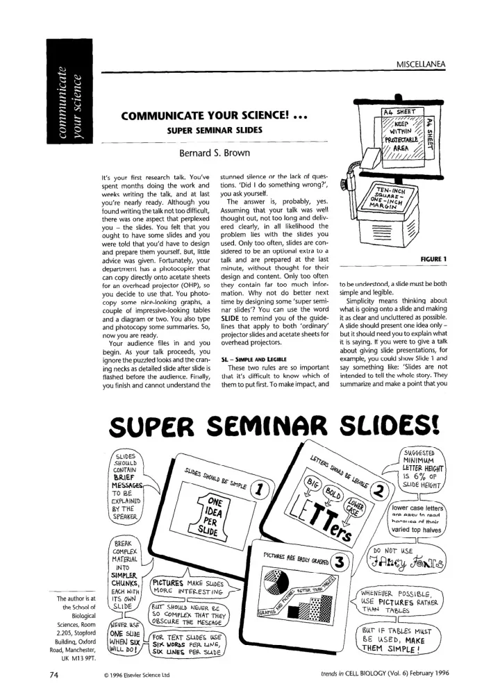
E - EASY
Your slides should be easy. Their content should make them easy to take in and understand. Their design should make them easy
the eye. One book points
that a slide presentation is a theatrical perfor- mance, a one-person show, with the audience wanting to be delighted with what it is seeing. If it is, then the audience will remember your slides long after your talk has ended. And those attending will also have fond memories
you as a good com- municator who presented some super seminar slides!
Here’s where to find more help:
ANHOLT,
Dazzle ‘em with Style - The Art of Oral Scientific Communication,
- pp. 99-l 24,
- W. H. Freeman
BIRCH, N. J. (1988) The rule of sixes,
BRISTOE, M. H. (1990) A Researcher’s Guide to Scientific and Medical Illustrations,
33, Springer-Verlag SIMMONDS,
- D. and REYNOLDS, L. (1994)
Data Presentation and Visual Literacy in Medicine ond Science, pp. 123-l 28 and 135-I 44, Butterworth-Heinemann
Microscopy animations
the Web
Lance A. Ladic and Alison M. J. Buchan
The advent
World Wide Web has enabled the presentation
media content
Internet and has simplified access to information. This communication technology holds great promise for the dissemination
scientific animations between researchers around the world, some- thing that is not easily done with exist- ing media. This article will examine some
the issues surrounding microscopy animations
the Web: what is out there, how to find it, how to put your animations
line and what is in store for the future. Although the primary focus
the article is on microscopy, the’topics discussed are also of general relevance to other types
animations
Web.
Types
An increasing number
researchers around the world are generating animations from digital microscopy data and are putting these
the Web to communicate their research to colleagues. These
include data from confocal microscopes, high-resolution charge- coupled device (CCD) cameras and
cellular-imaging devices. The animations are typically in the form
either time-lapse sequences depicting changes from image to image,
animations
three-dimensional (3-D) reconstructions generated from sequential stacks
2-D images through a specimen.
Locating microscopy animations
Although there are many microscopy animations
the Web, there is no central repository from which they can be accessed. Conducting keyword-based queries with Web search tools does not guar- antee success. Attempts have been made to compile a list of institutions that are involved with microscopy research (most notably at the Microscopes and Microscopy Web
Pageathttp://www.lars.bbsrc. ac . uk/micro/).
However, there are numerous sites with animations that are not listed. So, how do you locate microscopy animations
Web? The most common source
about new and existing animations are Internet mailing lists and Usenet newsgroups (see Box 1). Mail and News archives
the Web can also be searched for the mention
ani- mations. A helpful trick is to use key- words related to animation formats, such as ‘MPEC’ and ‘QuickTime’, in these queries. As part
a Web page that I maintain
(http://www.cs.ubc.ca/ spider/ladic/confocal.html),
I have compiled a list
sites that have animations related to 3-D confocal microscopy. Typically, most Web sites present
a small number
microscopy-related animations. Each
following sites utilizes ani- mation in a different way to present their research, and each serves as an example
the Web can be used to transfer visual information between colleagues. ‘FishScope’
(http: // weber.u.washington.edu/
contains an archive
time-lapse recordings and confocal microscope images dealing with the developmental biology
fish. Through viewing these animations, you can follow the movement
vidual cells at different stages
embryogenesis. Similarly, an ani- mation that follows the temporal development
a Cuenorhabditis elegans embryo at a single focal plane (using a confocal microscope) can be found
a Web page at the Integrated Microscopy Resource, University
USA
(http://www.bocklabs.wisc. edu/imr/instruments/4da. html).
Animations
reconstruc- tions
cells microinjected with modified
can be found
Daniel Chin’s home page from The Agouron Institute, La Jolla, CA, USA
(http://agi.org/
Some
animations demonstrate the appli- cation
a blind deconvolution algorithm to improve the resolution
linear structures in all viewing
76
0 1996 Elsevier Science Ltd trends in CELL BIOLOGY (Vol. 6) February 1996