
SLIDE 1
ì
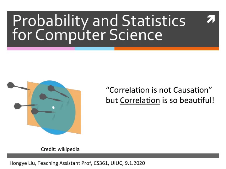
Probability and Statistics for Computer Science
“Correla)on is not Causa)on” but Correla)on is so beau)ful!
Hongye Liu, Teaching Assistant Prof, CS361, UIUC, 9.1.2020 Credit: wikipedia
Probability and Statistics for Computer Science Correla)on is not - - PowerPoint PPT Presentation
Probability and Statistics for Computer Science Correla)on is not Causa)on but Correla)on is so beau)ful! Credit: wikipedia Hongye Liu, Teaching Assistant Prof, CS361, UIUC, 9.1.2020 " " # in your Please use sign *
ì
Probability and Statistics for Computer Science
“Correla)on is not Causa)on” but Correla)on is so beau)ful!
Hongye Liu, Teaching Assistant Prof, CS361, UIUC, 9.1.2020 Credit: wikipedia
*
Please
use
"# "sign
in
your
chat
to
indicate
a
formal
question
comment
.*
please
mute
your
mic
eo
keep
the
Zoom
sound
quality
.*
please
check
the
websites
simulation
&
Code Notebook in
the
chat
. Last time
Location
Parameters
i
Mean IM)
,Median , Mode Scale
parameters
:Standard (g)
Interquartile
deviation
'
range ciqr)
variance (62 )
standardizing
Data :
'x'Ix
Objectives
Median, Interquar)le range, box
plot and outlier
ScaRer plots, Correla)on Coefficient Visualizing & Summarizing
rela%onships Heatmap, 3D bar, Time series plots, I
Median
To organize the data we first sort it Then if the number of items N is odd
median = middle item's value if the number of items N is even median = mean of middle 2 items' values
Properties of Median
Scaling data scales the median Transla)ng data translates the median
median({k · xi}) = k · median({xi})
median({xi + c}) = median({xi}) + c
median =
a rgmmin c Ei , ki- ul )
Percentile
kth percen)le is the value rela)ve to
which k% of the data items have smaller
Median is roughly the 50th percen)le
I' I
,2
,3
,4
,5
,6
,7
.12 }
.¥751
> 5th
percentile
= ?
6
Interquartile range
iqr = (75th percen)le) - (25th percen)le) Scaling data scales the interquar)le range Transla)ng data does NOT change the
interquar)le range
iqr({k · xi}) = |k| · iqr({xi}) iqr({xi + c}) = iqr({xi})
20
AT
Box plots
Boxplots
Simpler than
histogram
Good for outliers Easier to use
for comparison
Data from hRps://www2.stetson.edu/ ~jrasp/data.htm
Vehicle death by region
DEATH
Boxplots details, outliers
How to
define
(the default)
Whisker Box Median Outlier Interquar)le Range (iqr) > 1.5 iqr < 1.5 iqr
mean is more sensi)ve to outliers than median
⑦
True
B.
False
interquar)le range is more sensi)ve to outliers than std.
A
True
⑤
false
Sensitivity of summary statistics to
mean and standard devia)on are
very sensi)ve to outliers
median and interquar)le range are
not sensi)ve to outliers
Modes
Modes are peaks in a histogram If there are more than 1 mode, we
should be curious as to why
Multiple modes
We have seen
the “iris” data which looks to have several peaks
Data: “iris” in R
Iris
Example Bi-modes distribution
Modes may
indicate mul)ple
popula)ons
Data: Erythrocyte cells in healthy humans Piagnerelli, JCP 2007
red
blood cell Tails and Skews
Credit: Prof.Forsyth
tails
,
C
→ night +nil arrears
Median = 47
A Lep B Right
mean = ?
46
Looking at relationships in data
Finding rela)onships between
features in a data set or many data sets is one of the most important tasks in data analysis
Relationship between data features
Example: does the weight of people relate to
their height?
x : HIGHT, y: WEIGHT
Scatter plot
Body Fat data set
Scatter plot
ScaRer plot with density
O
O
Scatter plot
Removed of outliers & standardized
Correlation
y
covariance
ch
. Y . I 13 Correlation seen from scatter plots
Posi)ve correla)on Nega)ve correla)on Zero Correla)on
Credit: Prof.Forsyth
What kind of Correlation?
Line of code in a database and number of bugs Frequency of hand washing and number of
germs on your hands
GPA and hours spent playing video games earnings and happiness
Credit: Prof. David Varodayan
Correlation doesn’t mean causation
Shoe size is correlated to reading skills,
but it doesn’t mean making feet grow will make one person read faster.
Correlation Coefficient
Given a data set consis)ng of
items
Standardize the coordinates of each feature: Define the correla)on coefficient as:
corr({(xi, yi)}) = 1 N
N
yi
{(xi, yi)}
(x1, y1) ... (xN, yN),
std({xi})
std({yi})
Correlation Coefficient
corr({(xi, yi)}) = 1 N
N
yi
std({xi})
std({yi})
= mean({ xi yi})
Q: Correlation Coefficient
Which of the following describe(s)
correla)on coefficient correctly?
corr({(xi, yi)}) = 1 N
N
yi
A visualization of correlation coefficient
hRps://rpsychologist.com/d3/correla)on/ In a data set consis)ng of items shows posi)ve correla)on shows nega)ve correla)on shows no correla)on
{(xi, yi)} (x1, y1) ... (xN, yN),
corr({(xi, yi)}) > 0 corr({(xi, yi)}) < 0 corr({(xi, yi)}) = 0
The Properties of Correlation Coefficient
The correla)on coefficient is symmetric Transla)ng the data does NOT change the
correla)on coefficient
corr({(xi, yi)}) = corr({(yi, xi)})
The Properties of Correlation Coefficient
Scaling the data may change the sign of
the correla)on coefficient
corr({(a xi + b, c yi + d)}) = sign(a c)corr({(xi, yi)})
:
:
The Properties of Correlation Coefficient
The correla)on coefficient is bounded
within [-1, 1] if and only if if and only if
corr({(xi, yi)}) = 1 corr({(xi, yi)}) = −1
yi
yi
Which%of%the%following%has%correlation% coefficient%equal%to%1?%
#
Y
Y
Y
.
.
×
^
a
Concept of Correlation Coefficient’s bound
The correla)on coefficient can be
wriRen as
It’s the inner product of two vectors
and
corr({(xi, yi)}) =
N
√ N
√ N corr({(xi, yi)}) = 1 N
N
yi
√ N ,
...
√ N
√ N ,
...
√ N
Inner product
Inner product’s geometric meaning: Lengths of both vectors
are 1
θ ν2 ν1
|ν1| |ν2| cos(θ)
ν1= ν2=
√ N ,
...
√ N
√ N ,
...
√ N
Bound of correlation coefficient
θ ν2 ν1
|corr({(xi, yi)})| = |cos(θ)| ≤ 1
ν1= ν2=
√ N ,
...
√ N
√ N ,
...
√ N
The Properties of Correlation Coefficient
Symmetric Transla)ng invariant Scaling only may change sign bounded within [-1, 1]
Using correlation to predict
Cau'on! Correla)on is NOT Causa)on
Credit: Tyler Vigen
How do we go about the prediction?
Removed of outliers & standardized
Using correlation to predict
Given a correlated data set
we can predict a value that goes with a value
{(xi, yi)}
y0
p
x0
In standard coordinates
we can predict a value that goes with a value
{( xi, yi)}
p
Q:
Which coordinates will you use for the
predictor using correla)on?
D
Linear predictor and its error
We will assume that our predictor is linear We denote the predic)on at each in the data
set as
The error in the predic)on is denoted
ui
p
x + b
p = a
xi + b
ui = yi − yi
p =
yi − a xi − b
Require the mean of error to be zero
We would try to make the mean of error equal to zero so that it is also centered around 0 as the standardized data:
center
Yeargain
= mean 45 - ij% = mean 48⇒
b = 0
A
Require the variance of error is minimal
minimize
,
GZ
mean 14 Ui - mean#
3%2)
,-3 ,
O= mean CECE- ax
"-4533 a = mean 48'Hein"3sta'
= mean 48 '} )
TE
managing
moonlit-3)
=
i - rear ta
Ice-sashay
←varia't
da
Require the variance of error is minimal
Here is the linear predictor!
x
Correla)on coefficient
jP=a Ee b
q = r
b =o
Prediction Formula
In standard coordinates In original coordinates
r = corr({(xi, yi)})
p = r
x0
where
yp
0 − mean({yi})
std({yi}) = rx0 − mean({xi}) std({xi})
Root-mean-square (RMS) prediction error
Given var({ui}) = 1 − 2ar + a2 & a = r var({ui}) = 1 − r2
RMS error =
i })
√ 1 − r2
=
r=l
vary Uil > = o
See the error through simulation
hRps://rpsychologist.com/d3/correla)on/
Example: Body Fat data
r = 0.513
Example: remove 2 more outliers
r = 0.556
Heatmap
Summariza)on of 4 loca)ons’ annual mean temperature by month Display matrix of data via gradient of color(s)
3D bar chart
Transparent
3D bar chart is good for small # of samples across categories
Relationship between data feature and time
Example: How does Amazon’s stock change
take out the pair of features x: Day y: AMZN
Time Series Plot: Stock of Amazon
Scatter plot
Coupled with
heatmap to show a 3rd feature
Assignments
Finish reading Chapter 2 of the
textbook
Next )me: Probability a first look
Additional References
Charles M. Grinstead and J. Laurie Snell
"Introduc)on to Probability”
Morris H. Degroot and Mark J. Schervish
"Probability and Sta)s)cs”
See you next time
See You!