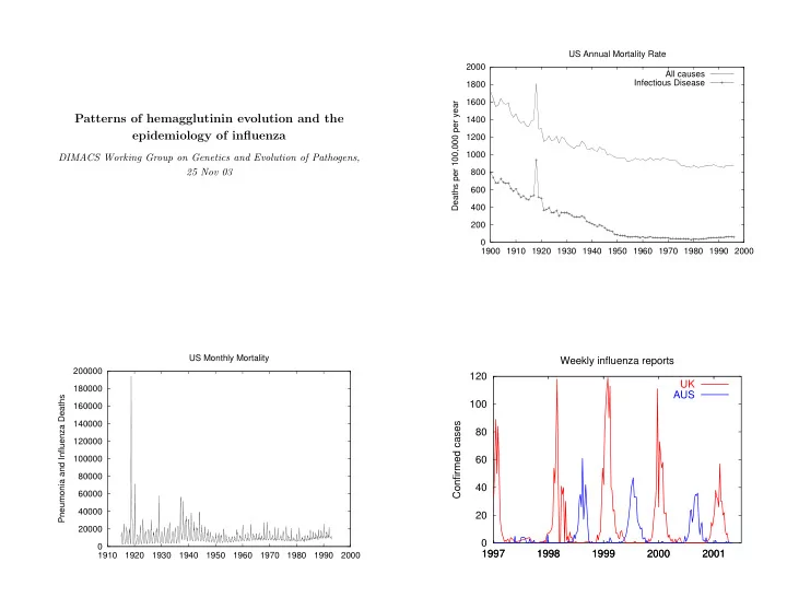
SLIDE 1
Patterns of hemagglutinin evolution and the epidemiology of influenza
DIMACS Working Group on Genetics and Evolution of Pathogens, 25 Nov 03
200 400 600 800 1000 1200 1400 1600 1800 2000 1900 1910 1920 1930 1940 1950 1960 1970 1980 1990 2000 Deaths per 100,000 per year US Annual Mortality Rate All causes Infectious Disease 20000 40000 60000 80000 100000 120000 140000 160000 180000 200000 1910 1920 1930 1940 1950 1960 1970 1980 1990 2000 Pneumonia and Influenza Deaths US Monthly Mortality
20 40 60 80 100 120 1997 1997 1998 1998 1999 1999 2000 2000 2001 2001 Confirmed cases Weekly influenza reports UK AUS
SLIDE 2
20 40 60 80 100 120 1997 1997 1998 1998 1999 1999 2000 2000 2001 2001 2002 Confirmed cases UK influenza by subtype H1 H3 B
Influenza viruses
Three types, A, B and C, in decreasing order of importance. Flu A has fifteen identified hemagglutinin subtypes, all of which are always present in waterfowl. Evolutionary shifts occur when core proteins from human-adapted strains recombine with surface proteins from avian strains, probably in people, domestic fowl or pigs. Evolutionary drift in the surface proteins means that most people are susceptible to a related, circulating strain of the flu around five years after recovery. An influenza virion
Shift evolution
Major antigenic change caused be reassortment between human and avian virus segments. 1918 Spanish flu (H1N1) replaces earlier strain. 1957 H2N2 replaces H1N1. 1968 H3N2 replaces H2N2. 1977 H1N1 mysteriously reappears. It is estimated that there have been roughly 10 influenza pandemics (presumably caused by shifts) in the last 250 years.
SLIDE 3
Drift evolution
The gradual accumulation of point mutations antibody-combining regions (epitopes), leading to immunological escape. Makes vaccine-strain selection very difficult. Annual epidemics due to drift cause more total mortality and morbidity than pandemics.
✁ ✂☎✄ ✆ ✁ ✝✞✟ ✠✡ ✝☛ ☞ ✌
Rambaut, et al., 2001 Fitch, et al., 1997
Why model infectious diseases?
How do local interactions explain population-level patterns? What can population-level patterns tell us about local interactions?
Questions to be addressed by influenza modelling
How do different subtypes interact at the population level, and what can this tell us about pandemics? What factors determine influenza’s unique phylogenetic patterns? Can predictions about drift evolution improve annual vaccine choices? Why does influenza incidence show such marked seasonal oscillations? What are the implications of influenza’s antigenic evolution for drug resistance?
SLIDE 4 Confronting models with data
Outline
Clustering More clustering Volatility More volatility
Quasispecies structure and the antigenic evolution
Joshua Plotkin, Jonathan Dushoff, Simon Levin; PNAS 99:6263 Questions
- What do modelers mean by a ‘strain’?
- What does strain space look like?
- Do influenza viruses cluster into ‘quasispecies’?
How to compare hemagglutinin molecules
Antigenic assays Three-dimensional structure Amino-acid sequence
SLIDE 5
Random clustering technique
Examine random clusters at different length scales Look for scales at which clusterings are stable; these are natural clusterings 0.1 0.2 0.3 0.4 0.5 0.6 0.7 0.8 0.9 1 5 10 15 20 25 30 Mean cluster size Threshold distance Codon clustering 0.1 0.2 0.3 0.4 0.5 0.6 0.7 0.8 0.9 1 2 4 6 8 10 12 14 Mean cluster size Threshold distance Amino acid clustering
1985 1990 1995 2000 10 20 30 40
Calendar year Cluster size
SLIDE 6 Clusters through time
- Quasispecies have limited temporal range
- Dominant quasispecies replace each other on a time scale of 2–5
years
- Evolution is linear over this time span in amino-acid space
5 10 15 20 25 30 35 40 1986 1988 1990 1992 1994 1996 1998 Number of sequences Geographic location by cluster China Other
84/85 89/90 94/95 99/00
5 10 15 20 25 30 35 40
WHO vaccine:
1 2 3 Mean dist. betw. seqs. Epitope A (19 sites) B (22) C (27) D (41) E (22) Other sites (198) 1 2 3 4 5 1984 1986 1988 1990 1992 1994 1996 1998 2000
- Dist. betw. cluster centroids
A B C D E Other
SLIDE 7 Conclusions
- Sequences are clustered in amino-acid space, forming natural
‘quasispecies’.
- Clusters replace each other on a time scale of 2–5 years.
- Clusters display interesting interactions with antibody-combining
regions (epitopes).
- Formal clustering methods have potential for predicting the
direction of influenza evolution.
Clustering methods for HA structures
with Ben McMahon and Joshua Plotkin If formal clustering methods assist in analysis of genomic patterns, can they also assist in analysis of structural patterns? Computational and algorithmic advances make it possible to make homology models for hundreds of sequences (based on known structures).
Homology modeling
Start with backbone in the same place as known structure. Adjust for stereochemical constraints and known motifs. Local energy minimization. Works surprisingly well over a broad range of proteins. Human H3 structures
SLIDE 8 The cartoon shape is the backbone (with a color gradient). Spheres are the side chains: White Non-polar Blue Positive Red Negative Green Other polar The yellow is a sialic acid analog bound to the protein.
Clustering methods for HA structures
Relative methods Calculate profiles based on the protein backbone (e.g. the electric field at each of the 329 alpha carbons).
- Hydrophobicity
- Electric field and potential measures
- Distance profiles
0.1 0.2 0.3 0.4 0.5 0.6 0.7 0.8 0.5 1 1.5 2 2.5 3 3.5 4 Cluster size Threshold distance Hamming 0.1 0.2 0.3 0.4 0.5 0.6 0.7 0.8 0.9 1 0.01 0.02 0.03 0.04 0.05 0.06 0.07 0.08 0.09 0.1 Cluster size Threshold distance Quasi-potential
SLIDE 9 No natural scale for structural clusters
Need more sophisticated clustering methods Evidence for compensatory mutations
10 20 30 40 50 60 1970 1975 1980 1985 1990 1995 2000 Year Hamming 0.05 0.1 0.15 0.2 0.25 0.3 0.35 0.4 0.45 0.5 1970 1975 1980 1985 1990 1995 2000 Year Quasi-potential 50 100 150 200 250 300 1970 1975 1980 1985 1990 1995 2000 Year Backbone
SLIDE 10 Provisional conclusions
Evidence for existence of compensatory mutations. Simple, relative measures, combined with homology models, may be able to detect and explain these compensatory mutations. More refined metrics needed to cluster in ways that will shed light on antigenicity. More refined clustering techniques may also be needed.
Codon bias and frequency-dependent selection on the hemagglutinin epitopes of influenza A virus
Joshua Plotkin and Jonathan Dushoff; PNAS 100:7152 Questions
- Can codon usage help to explain how hemagglutinin evolves so
quickly?
- Does hemagglutinin’s fast evolution leave a ‘footprint’ on codon
usage?
- Can we correlate genomic information about evolution with
structural information about hemagglutinin?
Natural selection in pathogens
Stabilizing selection (selection not to change) implies inflexibility, importance. Positive selection (selection to change) implies pressure from host immune system, or directional change (change of disease mechanism,
Useful for investigating biology and evolution of pathogens Potential applications for vaccine and drug development
Codon bias
Genomes use certain codons in high proportions, in preference to
- ther, synonymous codons. This is surprising because there is no
- bvious reason why the organism should distinguish between
synonymous codons. Some reasons for codon bias include:
- Nucleotide biases
- Mutational biases
- The mechanics of translation
- Evolutionary history
SLIDE 11
Bias towards volatility
Some codons have more synonymous neighbors than others. Under neutral selection, all of the non-stop neighbors of a codon are equally likely as predecessors. If a gene is under positive selection, the predecessor codon is more likely to have been non-synonymous. If a gene is under negative selection, the predecessor codon is more likely to have been non-synonymous. Thus, an overabundance of codons with more non-synonymous neighbors (high volatility) is a marker of positive selection. And conversely.
Volatility
CGA (R) TGA (Z) GGA (G) CTA (L) CCA (P) CAA (Q) CGG (R) CGT (R) CGC (R) AGA (R)
8 non-stop neighbors. 4 encode other amino acids (non-synonymous changes). Volatility = 4/8.
Volatility
CGA (R) TGA (Z) GGA (G) AGT (S) ACC (T) ATA (I) ACA (T) AGG (R) AAA (K) AGA (R)
8 non-stop neighbors. 6 encode other amino acids (non-synonymous changes). Volatility = 6/8.
Detecting bias towards volatility
Problem: Other sources of codon bias. Amino-acid composition of genes will bias measures of volatility. Solution: Control for amino-acid composition by making bootstrap copies of the gene, with the same amino-acid composition.
SLIDE 12 ATG GAG AGC CTT GTT CTT GGT GTC AAC GAG AAA ACA (Gene) M E S L V L G V N E K T (Protein) ATG GAG AGC CTT GTT cta ggc GTC aat GAG AAA act (Copy) A gene shows significantly high (or low) volatility if its volatility exceeds (is below) that of 97.5% of the bootstrap copies.
Bootstrap method
Controls for:
- nucleotide bias
- codon-specific bias
- Differences in underlying mutation rate
Does not control for:
- Expression bias
- Biases localized to certain parts of the genome
Is weakened by:
- Transition-transversion bias
- Specific highly mutable ‘motifs’
Currently more appropriate for pathogens than people
Volatility results
- Surface protein hemagglutin significantly volatile compared to
rest of genome
- Antibody-binding areas of hemagglutinin significantly volatile
compared to rest of hemagglutin
- No evidence that neuraminidase (the other surface protein) is
volatile. Confirms that antibody-binding areas of hemagglutinin are under pressure to evolve continually, due to selective pressure from the immune system.
Comparing different amino acid metrics
Hamming Acids are the same, or different Miyata Measures differences in size and hydrophobicity. Comparisons of epitopes to non-epitopes are much less significant under the Miyata metric, likely reflecting structural constraints.
SLIDE 13 Comparative hemagglutinin volatility
with Joshua Plotkin
Questions
Is volatility really sensitive enough to distinguish between different phenotypes of the same gene? Can we learn anything about shifts from volatility patterns in pandemic isolates?
0.995 0.996 0.997 0.998 0.999 1 1.001 1.002 1.003 1.004 1.005 1965 1970 1975 1980 1985 1990 1995 2000 Relative volatility Year H3N2 hemagglutinin isolates 0.994 0.996 0.998 1 1.002 1.004 1.006 1965 1970 1975 1980 1985 1990 1995 2000 Relative volatility Year Egg-sensitive residues excluded
SLIDE 14 0.99 0.995 1 1.005 1.01 1.015 1.02 1965 1970 1975 1980 1985 1990 1995 2000 Relative volatility Year Egg-sensitive residues excluded Epitopes Other 0.996 0.997 0.998 0.999 1 1.001 1.002 1.003 1975 1980 1985 1990 1995 2000 2005 Relative volatility Year H1N1 hemagglutinin isolates 0.996 0.997 0.998 0.999 1 1.001 1.002 1.003 1.004 1.005 1900 1920 1940 1960 1980 2000 Relative volatility Year H1N1 hemagglutinin isolates 0.7 0.8 0.9 1 1.1 1.2 1.3 50 100 150 200 250 300 350 Volatility profiles 1918 1955 2000
SLIDE 15
Conclusions
Not yet known if volatility is a sharp enough tool for this task. Stay tuned