
SLIDE 1
MOMENTUM THE WORLD IS WIDE, AND I WILL NOT WASTE MY LIFE IN - - PowerPoint PPT Presentation
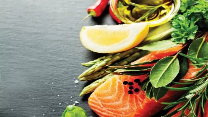
MOMENTUM THE WORLD IS WIDE, AND I WILL NOT WASTE MY LIFE IN FRICTION WHEN IT COULD BE TURNED INTO MOMENTUM. FRANCES E. WILLARD RAMP: The Nutrition Tracker Client EDGE is dedicated to providing a comprehensive fitness strategy that includes
http://www.ncbi.nlm.nih.gov/pmc/articles/PMC4319146/
http://www.ncbi.nlm.nih.gov/pmc/articles/PMC4319146/
1. Field is not editable, and should not appear as a data entry point. 2. Point fields look like buttons. 3. Slider indicators look like they can be adjusted. 4. Bottom buttons not intuitive. 5. Added easier toggling for back and forth views. 6. Added buttons for quicker communication. 7. Provided more robust visuals for data. 8. Incorporated consistent footer design.
1. Added clipboard icon to include additional client information. 2. Made points featured more prominently, to accentuate point system. 3. Moved arrows closer to date to help users understand intention. 4. User’s unclear about button. 5. Horizontal orientation of bar graph inconsistent with rest
Bio
lifestyle Wants
future for themselves Pain Points
“If you want results, you have to stick to the plan”
“Now that I have more time, I can focus on my health.” Bio
ASPCA Pain Points
Wants
1. Provided more robust visuals for data. 2. Incorporated consistent footer design.
1. No clear header bar in design 2. Added header bar based on testing feedback 3. Added footer bar, cleaned up icons and choices for footer nav. 4. Unclear, unlabelled icons in footer “nav” , moved “add” icon from footer nav as well.
1. Fields as pop up windows confusing for some testers 2. “Meal” field not clear, also as a data entry field, user’s can put anything they want. 3. Buttons too early in the process. 4. Added drop down for “meal” choice, to limit user’s options. 5. “Add” button moved away from fields to prevent confusion (unsuccessful).
1. Fields as pop up windows confusing for some testers 2. “Meal” field not clear, also as a data entry field, users can put anything they want. 3. Buttons too early in the process. 4. Added drop down for “meal” choice, to limit user’s options. 5. “Add” button moved away from fields to prevent confusion (unsuccessful).
1. Clearly label process in sub- header. 2. Visual graphs for better comprehension among users. 3. Static number fields unappealing to users. 4. Included daily parameters for a more thorough understanding
1. Clearly label process in sub- header. 2. Visual graphs for better comprehension among users. 3. Static number fields unappealing to users. 4. Included daily parameters for a more thorough understanding
1. Macro totals at top unclear, no indication of what number is
2. Unclear icons. 3. Incorporated icons to facilitate more thorough understanding
4. Added meal totals, per user requests/suggestions. 5. Point icons by each meal to promote point game system. 6. Visual bar for better user engagement and understanding.
1. Simple toggle, doesn’t meet all user needs, based on client designs. 2. Incorporated additional toggles, under icon pop-up, saves space looks good.
1. Simple toggle, doesn’t meet all user needs, based on client designs. 2. Incorporated additional toggles, under icon pop-up, saves space looks good.
1. Fast Add Link often
2. Maintain consistency of location of buttons for adding food. 3. User “Search” icon common practice. 4. Add “Fast Add” button, and
for easier comprehension
1. Fast Add Link often
2. Maintain consistency of location of buttons for adding food. 3. User “Search” icon common practice. 4. Add “Fast Add” button, and
for easier comprehension
1. Wording unclear in testing, users keep hitting “Finish,” even when more food needs to be added. 2. Re-word buttons for clarity.
1. Wording unclear in testing, users keep hitting “Finish,” even when more food needs to be added. 2. Re-word buttons for clarity.
1. Current items that have been added are easily overlooked by users. 2. Moved “Items(1)” to a button, consistent with other button placement and increased prominence of button.
1. Current items that have been added are easily overlooked by users. 2. Moved “Items(1)” to a button, consistent with other button placement and increased prominence of button.
1. “Edit” icon unclear and featured too prominently. 2. Remove “Edit” icon, replace with clickable “Favorite” icon to populate favorites list in food entry page. 3. Increase consistency of color usage. 4. Review icon choices, make more intuitive decisions for icons.
1. “Edit” icon unclear and featured too prominently. 2. Remove “Edit” icon, replace with clickable “Favorite” icon to populate favorites list in food entry page. 3. Increase consistency of color usage. 4. Review icon choices, make more intuitive decisions for icons.
1. Button placement not consistent with rest of buttons throughout the app. 2. Move button to a more consistent location
1. Button placement not consistent with rest of buttons throughout the app. 2. Move button to a more consistent location