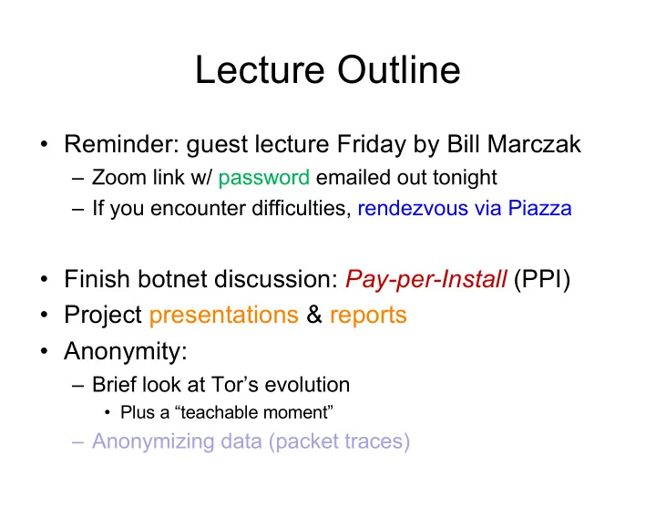
SLIDE 1 Lecture Outline
- Reminder: guest lecture Friday by Bill Marczak
– Zoom link w/ password emailed out tonight – If you encounter difficulties, rendezvous via Piazza
- Finish botnet discussion: Pay-per-Install (PPI)
- Project presentations & reports
- Anonymity:
– Brief look at Tor’s evolution
- Plus a “teachable moment”
– Anonymizing data (packet traces)

SLIDE 2
Pay-Per-Install (PPI)

SLIDE 3

SLIDE 4


SLIDE 6
The PPI Eco-system

SLIDE 7

SLIDE 8 8
Prices are USD per thousand installs

SLIDE 9 Project Presentations: Logistics
- Held last two weeks of regular Semester
– I’ll finalize assignments by this weekend
- Aim for ~30 minutes of material
- Split presentation w/ partner ~50/50
- Schedule practice talk w/ me 3+ days prior
– Should be fully drafted and timed
- Post short context summary to Piazza the
morning before
– Assume the class has read it

SLIDE 10 Project Presentations: Content
- Introduction framing apt for audience
– A thoughtful tour of the problem space
- This is the #1 value take-away for your fellow students
– What you tackled, why it’s significant – Assume audience has read your Piazza summary
- Sketch of related work sufficient to appreciate
contribution
– Will also address some “why didn’t you try X?” questions – Frame how other researchers have undertaken evaluations in this space

SLIDE 11 Project Presentations: Content, con’t
- Your strategy for pursuing your research
– Explain technical undertaking / challenges – Explain evaluation methodology
– What does it cover – What does it not cover – What you know about quality/representativeness – If you’re doing a security analysis, the “data” is your visibility into what you’re analyzing
- E.g. source code, black-box binaries, papers

SLIDE 12 Project Presentations: Content, con’t
- What unexpected issues arose?
– Emphasize lessons learned, not just surprises
- Can provide valuable take-aways for other work
- Preliminary results
– Bring out what is significant – Persuade us – Be thoughtful in data presentation (see below) – Illuminate limitations
– For your work – Implications / open questions for future work

SLIDE 13 Presenting Effectively: Slides
- Think creatively
- Make judicious use of color
- Avoid serif fonts
- Avoid overly busy slides
- Avoid “wall of bullets” on slide after slide 😐
- Use animations to engage your audience
– Keep them from peeking ahead, deciding they got it, and tuning out – Focus their attention by emphasizing current discussion point / downplaying non-points

SLIDE 14 Presenting Effectively: Voice
– ProTip: short phrases force fill-ins
- Do not read your speaker notes
– ProTip: try not having any (you won’t have any!)
- Find & deliver genuine energy/enthusiasm
- Vary your tone
– Glitches are an opportunity, not a problem: respond in the moment
- Find a conversational pace
- (Don’t worry about audience eye contact!)

SLIDE 15 Project Reports
- Treat the class Projects web page as a CFP
– CFP = Call For Papers – Formatting, deadline requirements are serious – Read and deliver on the Writing Pointers
- https://www.icir.org/vern/cs261n/writing.html
- “Be thoughtful in data presentation (see below)”

SLIDE 16 Huge amount of “real estate” to convey just

SLIDE 17
Conveys just 4 numbers. Not meaningful to interpolate points ⇒ do not connect with lines

SLIDE 18 Particularly meaningless to connect categorical points with lines. (“Instances” likely hugely
- vercounts polymorphic malware)

SLIDE 19
Plots only 7 (x,y) points … which are discretized. Wasted Y-axis real estate. Not clear why 8-hour bins are appropriate.

SLIDE 20
Hugely misleading compressed X-axis

SLIDE 21
Data glitch in second point visually dominates presentation. Straight-line interpolation on log-linear plot can be highly misleading.

SLIDE 22
Left-hand plot completely dominated by IN.failed. Right-hand plot just shows that all of IN.total was IN.failed.

SLIDE 23
Terrible use of “real estate”. Can’t tell anything about details other than single spike in the lowest bin. Much better to use logarithmic X-axis.

SLIDE 24
Conveys just 6 points. Avoid using lines to connect log-scaled values!

SLIDE 25

SLIDE 26
Misleading Y-axis: highly unlikely that changes between 7.8% and 8.25% are actually at all interesting

SLIDE 27
Large horizontal gaps make it visually a pain to read Why 4 tables and not one table with 5 columns?

SLIDE 28

SLIDE 29

SLIDE 30

SLIDE 31

SLIDE 32

SLIDE 33

SLIDE 34
Highly distracting central gap Just what do the authors want us to take away from this?

SLIDE 35
Unhelpful X-axis labels … (base?) Is gap between curves large or not? Wasted X-axis 6→8

SLIDE 36
Distribution for categorical data not meaningful

SLIDE 37
An example of good use of plot “real estate”
