statistics
play

Statistics Physics Chemistry Economics Biology - PowerPoint PPT Presentation

3-1 Definitions Statistics is a branch of Mathematics that deals collecting, analyzing, summarizing, and presenting data to help in the decision-making process. Statistics is applied in all fields of life such as:


  1. 3-1 Definitions فيراعت Statistics is a branch of Mathematics that deals collecting, • analyzing, summarizing, and presenting data to help in the decision-making process. • Statistics is applied in all fields of life such as: • Industry • Business • Education Statistics • Physics • Chemistry • Economics ءاـصحلئا • Biology • Agriculture • Psychology • Astronomy, etc. SET 3 - Chapter 3 2 GFP - Sohar University • 
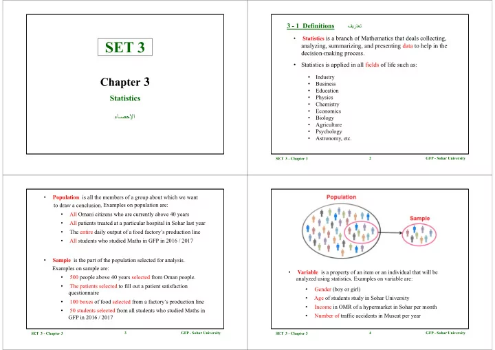
Population is all the members of a group about which we want to draw a conclusion. Examples on population are: • All Omani citizens who are currently above 40 years • All patients treated at a particular hospital in Sohar last year • The entire daily output of a food factory’s production line • All students who studied Maths in GFP in 2016 / 2017 • Sample is the part of the population selected for analysis. Examples on sample are: • Variable is a property of an item or an individual that will be • 500 people above 40 years selected from Oman people. analyzed using statistics . Examples on variable are: • The patients selected to fill out a patient satisfaction • Gender (boy or girl) questionnaire • Age of students study in Sohar University • 100 boxes of food selected from a factory’s production line • Income in OMR of a hypermarket in Sohar per month • 50 students selected from all students who studied Maths in • Number of traffic accidents in Muscat per year GFP in 2016 / 2017 3 GFP - Sohar University 4 GFP - Sohar University SET 3 - Chapter 3 SET 3 - Chapter 3

  2. 3 - 2 Presentation of Ungrouped Data ةـبﱠوـَبـُملا ريغ تانايبلا ضرع • Ungrouped data can be presented as diagrams in several ways including bar graph and pie chart. • Pie chart is a circular diagram of data where the area of the whole • Bar graph or chart consists of two or more categories along one axis and a pie represents 100% of the data and slices of the pie represent the series of bars, one for each category, along the other axis. The length of the percentage breakdown of the categories. Pie charts show the bar represents the magnitude of the measure (amount, frequency, money, relative magnitudes of the parts to the whole. percentage, etc.) for each category. The bar graph may be either horizontal or vertical . SET 3 - Chapter 3 5 GFP - Sohar University SET 3 - Chapter 3 6 GFP - Sohar University • The figure below shows a vertical bar graph presentation of the • A bar graph may also be placed on its side with the bars going expenditures of a college undergraduate for the past year . horizontally, as shown in the figure below: • Comparing the size of the bars, we can quickly see that room and board expenses are nearly double tuition fees, and tuition fees are more than double books and lab or transportation expenses. 7 GFP - Sohar University 8 GFP - Sohar University SET 3 - Chapter 3 SET 3 - Chapter 3

  3. 3 - 3 Frequency Distribution يراركتلا عيزوتلا • The bar graph have a limitation that it’s difficult to see what portion of the total each item comprises. If knowing about a “part of the • A frequency distribution is an organized tabulation showing exactly whole” is important, then a pie chart is a better choice for showing how many values are located in each class. the same data. • A frequency distribution presents an organized picture of the entire set • A pie chart may also display each category’s percentage of the total. of scores, and it shows where each values is located relative to others in • Using the same data from the previous example, we get the pie the distribution. chart shown below. • An example on frequency distribution is the marks of 16 students scored in a SET 1 quiz: { 65 , 73 , 64 , 85 , 66 , 77 , 82 , 93 , 86 , 63 , 58 , 63 , 62 , 79 , 61 , 74 } Class Class Boundaries Tally Frequency 50 – 59 49.5 – 59. 5 I 1 60 – 69 59.5 – 69.5 IIII II 7 70 – 79 69.5 – 79.5 IIII 4 80 – 89 79.5 – 89.5 III 3 90 – 99 89.5 – 99.5 I 1 Total 16 SET 3 - Chapter 3 9 GFP - Sohar University SET 3 - Chapter 3 10 GFP - Sohar University • Below is the steps of constructing a frequency distribution: • Step 5: Write down your lowest value for your first lower limit. Add the class width from Step 4 to Step 5 to get the next class lower limit. • Step 1: Figure out how many classes you need. There are no strict rules about how many classes to choose, but there are a two general • Step 6: Keep on adding your class width to your lower limit values guidelines: until you have created the number of classes you chose in Step 1. - Choose between 5 and 20 classes. - Make sure you have a few values in each category. For example, • Step 7: Write down the class upper limits. These are the highest values if you have 20 values, choose 5 classes (4 values per category), that can be in the category, so in most cases you can subtract 1 from not 20 classes (which would give you only 1 value per category). class width and add that to the lower limit. • Step 2: Find the range by subtracting the lowest value from the highest • Step 8: Find the class boundaries by subtracting 0.5 from each lower value in your data set. class limit and adding 0.5 to each upper class limit. • Step 3: Divide your answer in Step 2 by the number of classes you • Step 9: Tally the scores by counting the number of items in each class, chose in Step 1. and put the total in the third column called frequency. • Step 4: Round the number from Step 3 up to a whole number to get the class width. 11 GFP - Sohar University 12 GFP - Sohar University SET 3 - Chapter 3 SET 3 - Chapter 3

  4. 3 - 4 Presentation of Grouped Data ةـبﱠوـَبـُملا تانايبلا ضرع Example 1: For the set of IQ scores: 118, 123, 124, 125, 127, 128, 129, 130, 130, 133, 136, 138, 141, 142, 149, 150, and 154, construct: • Grouped data is presented by histogram and frequency polygon. (a) 5 classes frequency distribution (b) histogram • The table at right is a frequency distribution (c) frequency polygon. of heights (recorded to the nearest inch) of 100 male students at Sohar University. Solution: • The histogram and frequency polygon for this distribution are as shown below: (a) Frequency Distribution: Step 1: We will construct a frequency distribution with 5 classes. Step 2: Range = Highest Value – Lowest Value = 154 – 118 = 36 Histogram Frequency Polygon Step 3: Class width = (Range / No. of classes) = 36 / 5 = 7.2 Step 4: Class width = 8 SET 3 - Chapter 3 13 GFP - Sohar University SET 3 - Chapter 3 14 GFP - Sohar University Step 5, 6, 7, 8 and 9: are as in the following table: (b) Histogram Thus, the frequency distribution is shown in the table below: 15 GFP - Sohar University 16 GFP - Sohar University SET 3 - Chapter 3 SET 3 - Chapter 3

  5. 3 - 5 Measures of Central Tendancy for Ungrouped Data (c) Frequency Polygon ريغ تانايبلل زكرمتلا سـيـياقمةـبﱠوـَبـُملا • There are many different measures of central tendency. The three most widely used measures of central tendency are the mean, median, and mode. • The mean ( ) for a sample consisting of n observations is: • The median is the middle number in a group of numbers arranged in sequential order. In a set of numbers, half will be greater than the median and half will be less than the median. • The mode is the value in a data set that occurs the most often. If no such value exists, we say that the data set has no mode. If two such values exist, we say the data set is bimodal. If three such values exist, we say the data set is trimodal. SET 3 - Chapter 3 17 GFP - Sohar University SET 3 - Chapter 3 18 GFP - Sohar University Example 4: Find the median of the following set of numbers: Example 2: Find the mean of the following set of numbers: 5, 7, 19, 12, 4, 11, 15. 6, 8, 19, 14, 4, 11, 15. Solution: Solution: Putting the numbers in sequential order gives: 4, 5, 7, 11, 12, 15, 19 The middle number is the median, so 11 is the median. Example 5: Find the median of the following set of numbers: Example 3: Ahmed has four grades of equal weight in Maths. 5, 7, 19, 12, 4, 11, 15, 13. They are 82, 90, 88, and 85. What is Ahmed’s mean in Maths? Solution: Solution: Arranging the values gives: 4, 5, 7, 11, 12, 13, 15, 19 There are two middle numbers: 11 and 12, So, the median 19 GFP - Sohar University 20 GFP - Sohar University SET 3 - Chapter 3 SET 3 - Chapter 3

Download Presentation
Download Policy: The content available on the website is offered to you 'AS IS' for your personal information and use only. It cannot be commercialized, licensed, or distributed on other websites without prior consent from the author. To download a presentation, simply click this link. If you encounter any difficulties during the download process, it's possible that the publisher has removed the file from their server.

Recommend


More recommend