
SLIDE 1
Renaissance Renaissance means revival or rebirth and it signaled a - - PowerPoint PPT Presentation
Renaissance Renaissance means revival or rebirth and it signaled a renewed interest in the classical literature of ancient Greece and Rome. Renaissance An emphasis was placed on science, medicine and art the humanities .
Renaissance Renaissance means “revival” or “rebirth” and it signaled a renewed interest in the classical literature of ancient Greece and Rome.
Renaissance An emphasis was placed on science, medicine and art — the humanities.
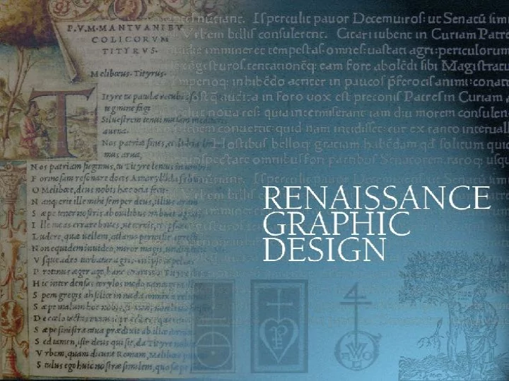
Graphic Design
Renaissance Germany exports typography to Italy and soon Venice becomes the printing center of Europe.
Sweynheym and Pannartz Two German printers, Konrad Sweynheym and Arnold Pannartz are invited to Italy to start a printing press by Italian Cardinal Turrecremata in 1465.
Sweynheym and Pannartz They began the redesign of the familiar Gothic typeface with the characteristics of the classical roman typefaces they studied in Rome.
Johannes de Spira A goldsmith from Mainz, de Spira was given a 5-year monopoly to print in Venice and developed an improved roman
the first book with numbered pages.
Nicolas Jenson Jenson had been Master of the Royal Mint of Tours in
Venice to start another press after de Spira’s death. He went on to perfect the roman typeface.
Nicolas Jenson Jenson is credited with the design for the Society of Venetian Printers. Such printers’ marks were used to distinguish individual print shops and verify the authenticity of their publications. Nicolas Jenson
Printer’s marks Early printers used printer’s marks as trademarks to identify which books they printed and to discourage copies.
Calendarium Renaissance designers loved floral decorations. The Calendarium had the first title page used in a book.
Calendarium The Calendarium contained 60 diagrams of solar and lunar eclipses printed in yellow and black. Scientific studies helped disprove superstitions about such natural events.
Calendarium It included ornate initial caps and a mathematical wheel that rotated for calculating solar cycles.
De Re Militari translates as “About Warfare” and it served as a manual for weaponry and strategy.
This manuscript used semi-gothic script and illustrated with woodcuts. The layout is open and without borders.
Not all the designs were real. The De Re Militari was printed in 1472.
Humanism A philosophy that man was capable
and scientific inquiry to better understand the world.
Aldus Manutius He was a humanist and printer who established a press in Venice to print the great works of the Roman and Greek scholars.
Aldus Manutius From 1494 until 1498, a five- volume edition from Aristotle was
edition printed in Greek.
Aldine anchor His printer’s trademark used an anchor and a dolphin, the swiftest sea creature, to signify the epigram “Make Haste Slowly.”
Aldus Manutius A page from his book Hypnerotomachia Poliphili, or “The Dream of Poliphilus” exhibited the best in printing of the Italian Renaissance.
Hypnerotomachia Poliphili The woodcuts illustrate the dreams of Poliphili as he seeks the courtship of his lover. Many of the characters include Greek and Roman gods and mythological creatures.
Hypnerotomachia Poliphili The superb roman typography was designed by Manutius’ employee and typefounder, Francesco Griffo.
Old Style Roman The design pairs the Roman capitalis monumentalis with the calligraphic flair
Old Style Roman fonts
Virgil’s Opera The first pocket book by Aldus Manutius with Francesco Griffo’s
economical, it was the first to use italic type to save space.
Italic Type Aldus Manutius’ first italics had short upright capital letters. The narrow compressed type added 50% more characters to a line.
French Renaissance The Kingdom of France fought for 50 years to conquer Italy, but got in return only renaissance humanism. Henri Estienne – and more notably, his son Robert – were early scholar- printers who sought to bring classical literature to France.
Fleurons – “printer’s flowers” Fleurons were engraved and cast in metal and used along with type to adorn printed pages.
Ars Moriendi A book to prepare one for death, the Ars Moriendi was the earliest known printing that used fleurons in its borders and between words..
The Golden Age of French Typography Robert Estienne combined the expert typography of Claude Garamond with the engraved initials of Geoffroy Tory to print the Biography of Twelve Early Milanese in 1549.
The Golden Age of French Typography Garamond and Tory’s types were a lighter
type was so popular, the fonts remained unchanged for 200 years.
The Golden Age
Typography Robert Estienne held the title of “royal typographer” by France’s king, yet had to flee Paris to Geneva in 1550 to escape censorship for his humanist leanings.
Geoffroy Tory Considered the quintessential “renaissance man” for he was a scholar, translator, poet, author publisher, printer, designer, calligrapher, illuminator and engraver.
Geoffroy Tory He developed a series of books detailing the French Renaissance school of book design and illustration.
Geoffroy Tory His book the Champ Fleury set the standard for type and design during France’s “golden age of typography.”
Geoffroy Tory The Champ Fleury features 3 volumes that examine letterforms, the French language and the ideal proportions of human form and letters.
Geoffroy Tory His trademark broken urn, was made in memory
who died at age 10.
Claude Garamond He worked in Paris and was the first punch cutter to work independently of printing firms.
Claude Garamond He sold his cast fonts directly to printers perfecting type that achieved a tighter fit and closer word spacing.
Claude Garamond He worked as an assistant to Geoffroy Tory and went on to design the ideal Greek and Roman letters.
By 1562, religious wars erupted across the countryside, driving many printers out of France to escape religious persecution, censorship and restrictive trade laws imposed by a suspicious monarchy.
Basel and Lyons are design centers Printers published works on medicine and modern anatomy as well as popular romances.
Copperplate engraving By the 17th century, printing spread to North America. Copperplate engraving had become a detailed form of commercial art.
Caslon Baskerville Bodoni The 18th Century was a time of typographic perfection. The roman-style typeface was redefined by these masters of type design.
In 1692, French King Louis XIV
type design for his Imprimerie Royal, or the royal printing
He appointed a committee of scholars, headed by a mathematician, to study and redesign the typeface using scientific principles.
Romain du Roi The Romain du Roi, or “King’s Roman,” was an alphabet built on a grid of 64 units, with each unit divided into another 36 units.
The Romain du Roi featured more contrast between the thick and thin strokes, had sharp horizontal serifs and an even balance to each letterform.
In 1702, the Medailles folio became the first book printed in the new Romain du Roi alphabet.
Transitional Roman Type The Romain du Roi was considered transitional because it marked an era between old style and modern roman type.
Transitional Roman fonts
The Rococo era 1720 to 1770 was an era of fancy French art, architecture and fashion.
Rococo style is known for its florid, intricate
S and C-shaped curves, scrollwork and plant motifs derived from nature, classical and oriental art.
At age 24, Pierre Simon Fournier le Jeune (junior), son of a prominent family
started his own type design and foundry business.
Fournier le Jeune favored ornate rococo-styled fonts and transitional redesigns of the Romain du Roi.
Pierre Simon Fournier He published a book of type specimens which he titled Modeles de caracteres de I’imprimerie (Models of Printing Characters) in 1742.
Modeles de caracteres de I’imprimerie (Models of Printing Characters) He started the various widths and weights that began the idea of type “families.”
Modeles de caracteres de I’imprimerie (Models of Printing Characters) Fournier established standardized type sizes: The King’s foot measured 12 thumbs. Thus, a foot equaled 12
divided into 72 points.
Fournier le Jeune introduced a system of type measurement based
Fournier le Juene gave rococo printers a complete set of roman, italic, script, and decorative styles to work with.
Many of his books featured fine line copperplate engravings that illustrated the wealthy living extravagant lives.
Delicate rococo-style copperplate engravings flourished in the 1700s.
Copperplate engravings allowed the popular use of fine hand-inscribed scripts.
Copperplate engravings George Bickham (the Elder) was an English writing master and
his engraving work in The Universal Penman.
George Bickham The Universal Penman was a collection of writing exemplars which helped to popularize the English Round Hand script in the 18th century.
Typography in England Since the 17th century, typography and printing was hindered by censorship, religious persecution and government control.
In 1660, King Charles II demanded that the number of printers be reduced to twenty “by death or
William Caslon Started as an apprentice to a London engraver of gunlocks and barrels. He later opened his
gilding and letterstamping for bookbinders.
A printer suggested he try type design and foundry – which he did and then designed Caslon Old Style in 1720.
For nearly 60 years, all of England used Caslon type. This carried
John Baskerville Started his career as a writing teacher and a stonecutter of gravestones.
John Baskerville He made his fortune manufacturing Japanned ware: durable pieces of lacquered hand-painted items.
Woven hot press Laid cold press Baskerville developed a denser black ink made from varnish and linseed oil. He manufactured the first smooth “hot press” paper.
Woven hot press Laid cold press For 500 years the English produced coarse laid papers from screens made of parallel wires. Baskerville developed special fine mesh screens to produce his smooth wove papers.
Baskerville refined the roman typeface in what became a transitional roman style: straighter strokes with more contrast than the traditional Old Style type.
Baskerville designed books without flowers,
decorated initials — just pure, elegant type with wide margins and
The Modern Style Following along the trends established by Fournier and Baskerville, Giambattista Bodoni developed a new design for type in Italy.
Bodoni admired the work of Baskerville. In 1790, he created a modern type with longer ascenders, descenders and thick straight vertical strokes and slab serifs.
Bodoni’s layouts abandoned the ornate rococo style that had gone out with the French Revolution. His became the signature style of the modern era.
Critics hailed Bodoni’s Manuale tipographico of 1818 as the typographical expression of “neoclassicism”. His crisp letterforms featured extreme weight contrasts between the thick and thin strokes.
Pierre Didot The Didots were a family dynasty of printers in France during the mid 1700s. Pierre Didot took Bodoni’s elegant simplicity and refined it further, perfecting the neoclassical style.
Neoclassical Graphic Design The trend of typographical simplicity during the second half of the 18th century in Europe saw the increasing influence of classical antiquity on artistic style and graphic design.
Neoclassical Graphic Design artistic style and graphic design. Simple, elegant page designs illustrated in detailed copperplate engravings were typical of the books dedicated to science, nature and new editions of the Greek and Roman classics. Such neoclassicism meant a return to “antique virtue.”
Stereotyping The Didot foundry invented stereotyping: a process that made a duplicate matrix of relief to be cast into metal plates
The Didot type foundry experimented with fat and thin typefaces similar to what we now call expanded and condensed fonts.
Pierre Didot By 1818, both Giambatista Bodoni and Pierre Didot pushed the modern style of roman typography to the limit.
Modern (also called didone) type characteristics
Modern Roman fonts
Infographics In the late 1700s, William Playfair used mathematical formulas to convert statistical data into symbolic graphics.
In 1786, Playfair published the Commercial and Political Atlas, a book that tracked England’s imports and exports by statistics, allowing trade surpluses and deficits to be seen at a glance.
But even two decades before Playfair began visualizing data, Joseph Priestly had begun recording timelines.
By the 18th century, infographics were used to analyze the logistics of war in myriad ways, plotting information across lines of time and space.
Thomas Bewick and William Bulmer Bewick and Bulmer worked together as engraver and printer producing many of the finest books on nature history of the time.
Thomas Bewick Bewick achieved a remarkable tonal range by combining white and black lines in his wood engravings.
Wood Engraving Using a fine stylus to hand-engrave illustrations from blocks of wood rather than copper plates, Bewick’s “white line”tonal effect became a major illustration method in letterpress printing.
William Blake To counterpoint the precise modern designs of the 18th century, Blake was an engraver who illuminated his poetry with hand-lettered type.
William Blake His artistic expressions were meant to transcend commercial design, yet many people failed to grasp his vision and thought he was crazy.
Relief Etching In 1788, Blake experimented with combining his text and illustrations on copper plates using pens and brushes, then etched the plates in acid to dissolve the untreated copper and leave the design standing in relief. His pages were hand- colored using water colors.
William Blake His works were not widely appreciated during the age
and he died in poverty and neglect. Today, his work is seen as the beginnings of Romanticism – and a leading influence toward impressionism, art nouveau and abstract art.