SLIDE 1 An introduction to data vizualisation
Christophe 19 f´ evrier 2013
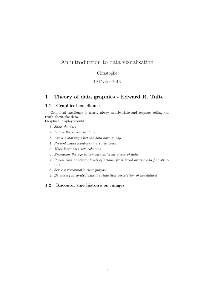
1 Theory of data graphics - Edward R. Tufte
1.1 Graphical excellence
Graphical excellence is nearly alway multivariate and requires telling the truth about the data. Graphical display should :
- 1. Show the data
- 2. Induce the viewer to think
- 3. Avoid distorting what the data have to say
- 4. Present many numbers in a small place
- 5. Make large data sets coherent
- 6. Encourage the eye to compare different pieces of data
- 7. Reveal data at several levels of details, from broad overview to fine struc-
ture
- 8. Serve a reasonnable clear purpose
- 9. Be closely integrated with the statistical description of the dataset
1.2 Raconter une histoire en images
1
SLIDE 2 Figure 1: Carte figurative des pertes successives en hommes de l’arm´ ee Fran- ¸ caisee dans la campagne de Russie en 1812-1813, Charles Minard (1869) Figure 2: Horaires des trains entre Paris et Lyon, E.J. Marey (1885) This method is attributed to the French engineer Ibry, but new evidence suggests that Lt. Sergeev had developed this method approximately 30 years earlier in
- Russia. Source E. R. Tufte
2
SLIDE 3
Figure 3: Evolution de la consommation de ressources energ´ etiques ; Source <http://www.digital-leads.com/2012/11/informationen-gestalten/> Figure 4: Lignes a´ eriennes aux USA. Source Aaron Koblin <http://www. aaronkoblin.com/work/flightpatterns/index.html> 3
SLIDE 4 Figure 5: Niveaux de neige et pr´
et´ eoFrance <http:// www.infoneige.com/nivose-cerdagne-canigou> 4
SLIDE 5 Figure 6: Statistical Breviary by William Playfair (1801) Source : E. R. Tufte
1.3 Rules
- 1. Above all else show the data
- 2. Maximize the data-ink ratio
- 3. Erase non-data-ink
- 4. Erase redudant data-ink
- 5. Revise and edit
2 Graphical Integrity
Graphical excellence begins with telling the truth about the data, so a lie factor can be constructed to compute the misrepresentation. LieFactor = size of effect shown in graphic size of effect in data (1)
2.1 Exemples
5
SLIDE 6
Figure 7: Governemnt spending ”Skyrocketing”. Source : E. R. Tufte from Playfair(1786) Figure 8: Governemnt spending ”Skyrocketing”. Source : E. R. Tufte from Playfair(1786). In a note Playfair says that the spending are now in real and not nominal millions ! 6
SLIDE 7 Another example of a big lie. Thee real magnitude of change in cars consump- tions is of 18 mpg in 1978 to 27.5 mpg in 1985, so the change is of 53% in 7
- years. On the graph, the horizontal line is 1.5 cm in 1978 and 13 cm in 1985, so
the visual change is around 75% making the lie factor reaching 14.5% ! ! ! Figure 9: Fuel economy standards. Source : E. R. Tufte (from NY Times 1978) Figure 10: Fuel economy standards, another view. Source : E. R. Tufte from NY Times 1978 7
SLIDE 8
2.2 Exemples with MS-Excell
Figure 11: Dette des administrations publiques. Etat vs Ensemble. Source : INSEE Les d´ epenses de l’´ etat (vert) semblent croitre plus fortement 8
SLIDE 9
Figure 12: Dette des administrations publiques. Etat vs Ensemble. Source : INSEE Figure 13: Dette des administrations publiques. Etat vs Ensemble. Source : INSEE 9
SLIDE 10 2.3 Data-ink ratio
Ink shoul present data-information. Data-ink is the non-erasable core of
- graphic. The E. Tufte defines the data-ink-ratio as :
Data − ink − ratio = data − ink total ink used to print the graphic (2) in the following, we will analyse how much of the information could be era- sed... Figure 14: Dette des administrations publiques. Etat vs Ensemble Source : INSEE 10
SLIDE 11 3 Boxplots and Co
Le Box-plot est surement le plus simple et le plus utilis´ e pour comparer des distributions entre groupes d’individus par exemple. Il n’est pas interdit d’utiliser des couleurs et les axes horizontaux et verticaux...
g1 g2 g3 g4 g5 98 100 102 104 106 108 110 Groupe Response
11
SLIDE 12 3.1 Let’s erase stuff...
g1 g2 g3 g4 g5 98 102 106 110 Groupe Groupe
3.2 Let’s change the shape...
Box-percentile plots are similiar to boxplots, except box-percentile plots supply more information about the univariate distributions. At any height the width of the irregular ”box” is proportional to the percentile of that height, up to the 50th percentile, and above the 50th percentile the width is proportional to 100 minus the percentile. Thus, the width at any given height is proportional to the percent of observations that are more extreme in that direction. As in boxplots, the median, 25th and 75th percentiles are marked with line segments across the box. see http://had.co.nz/stat645/project-03/boxplots.pdf. 12
SLIDE 13 Normal Uniform −3 −2 −1 1 2 3 4
Boxplot
−3 −2 −1 1 2 3 4
Box−Percentile Plot
Normal Uniform
On peut voir la diff´ erence sur 2 groupes tir´ es al´ eatoirement de la mˆ eme distribution :
Group 1 Group 2 −3 −2 −1 1 2 3 4
Boxplot
−3 −2 −1 1 2 3 4
Box−Percentile Plot
Group 1 Group 2
The boxplot has friends... The first figure show the underlying density of the 13
SLIDE 14 random generated data : a normal mixture of two components. Then, from left to right are plotted variations around the idea of a boxplot.
- 1. Underlying bimodal density
- 2. The boxplot itself, which concentrates on the central bulk of the data
- 3. The HDR boxplot, which looks at the zone of highest density
- 4. The Violin plot, that uses kernel estimator of the density
- 5. The Box-Percentile plot, same as boxplot, but showing more informa-
tion about the density Sur une distribution ”classique” et unimodale, on ne diff´ erencie pa les 4 box- plot :
0.0 0.2 0.4 1 2 3 4 5
Underlying density
1 2 3 4 5
standard boxplot
1 2 3 4 5
HDR boxplot
1 2 3 4 5 1
violin plot
1 2 3 4 5
Box−Percentile Plot
x
Mais si l’on change la distribution, pour la rendre bi-modale. Only the violin plot and the HDR boxplot capture the bimodality in that dataset. Given that the dataset is truly bimodal, they are, in that case, better than the standard boxplot and the Box percentile plot. 14
SLIDE 15 0.05 0.15 −2 2 4
Underlying density
−2 2 4
standard boxplot
−2 2 4
HDR boxplot
−2 2 4 1
violin plot
−2 2 4
Box−Percentile Plot
x
Source http://gallery.r-enthusiasts.com/graph/The_boxplot_friends_ 102. McGill, Tukey and Larsen (1978) introduced the Variable Width box- plot,where width is used to represent the density, and this is believed to prevent misinterpretation of certain characteristics of the data, in particular the median. In the same paper he introduced the Notched boxplot, which adds yet ano- ther element to the original boxplot by displaying confidence intervals around the medians. Doing so allows one to visually determine whether or not the me- dians are significantly different between groups. 15
SLIDE 16 Group 1 Group 2 Group 3 1 2 3 4
Boxplot
Group 1 Group 2 Group 3 1 2 3 4
with variable width
Group 1 Group 2 Group 3 1 2 3 4
with var. width and Notches
16
SLIDE 17 3.3 Context is important !
2.00e+08 4.00e+08 6.00e+08 8.00e+08 Total Passengers 2001 2002 2003 2004 Year
Passagers sur Air China
5.00e+08 1.00e+09 1.50e+09 Total Passengers 1990 1995 2000 2005 2010 Year
Passagers sur Air China 17
SLIDE 18 5.00e+08 1.00e+09 1.50e+09 2.00e+09 Total Passengers 5.00e+08 1.00e+09 1.50e+09 Total Passengers 1990 1995 2000 2005 2010 Year Air China British Airways
Passagers
18
SLIDE 19 4 Visualiser des relations
4.1 De l’int´ erˆ et de visualiser - F.J. Anscombe
Considerons les 3 jeux de donn´ ees propos´ es par F. J Anscombe (X1, Y1),(X2, Y2) & (X3, Y3)
Variable n Min q1
¯ x q3 Max X1 11 4 6.50 9 9 11.50 14 X2 11 4 6.50 9 9 11.50 14 X3 11 4 6.50 9 9 11.50 14 X4 11 8 8.00 8 9 8.00 19
Table 1: Summary of the 3 data sets : Xs
Variable n Min q1
¯ x q3 Max Y1 11 4.26 6.31 7.58 7.50 8.57 10.84 Y2 11 3.10 6.70 8.14 7.50 8.95 9.26 Y3 11 5.39 6.25 7.11 7.50 7.98 12.74 Y4 11 5.25 6.17 7.04 7.50 8.19 12.50
Table 2: Summary of the 3 data sets : Ys Notons que les correlations sont cor(X1, Y1) = 0.8164, cor(X2, Y2) = 0.8162, cor(X3, Y3) = 0.8163 et enfin cor(X4, Y4) = 0.8165 . Maintenant, regardons vraiment ces donn´ ees :
5 10 15 20 2 4 6 8 10 14
X1−Y1
dataAnscombe$x1 5 10 15 20 2 4 6 8 10 14
X2−Y2
dataAnscombe$x2 5 10 15 20 2 4 6 8 10 14
X3−Y3
5 10 15 20 2 4 6 8 10 14
X4−Y4
19
SLIDE 20 4.2 Scatterplot with Tufte axes
Old Faithful Eruptions (271 samples)
Time till next eruption (min) Duration (sec) 43 50 55 60 65 70 75 80 85 90 96 96 150 200 250 306 Previous duration
La version 3D de la densit´ e (estim´ ee avec le package np de R)
eruptions 2 3 4 5 waiting 40 60 80 100 Joint Density 0.00 0.01 0.02 0.03 0.04
20
SLIDE 21
5 Visualier “d’autres choses”
5.1 Visualiser des r´ eseaux
Figure 15: Relations entre les personnages de Mark Twain Source : Pajek http://pajek.imfm.si/doku.php?id=links 21
SLIDE 22
Figure 16: Relations entre les diff´ erentes marques et groupes dans les IAA http://www.convergencealimentaire.info/?attachment_id=238 Figure 17: Relations entre diff´ erents co-auteurs http://www. bordalierinstitute.com/target11.html 22
SLIDE 23 5.2 Visualiser dans l’espace et le temps
Figure 18: Exemple d’information a deux niveaux, le trajet et l’altitude de la route de migration des
Source Hawkes et al. (2012). http://sciencythoughts.blogspot.fr/2012/11/ how-bar-headed-geese-cross-himalayas.html 23
SLIDE 24
Figure 19: L’IGN propose de nombreux outils de visualisation dans l’espace, par exemple pour visualiser les changements entre 2 dates. http://logiciels. ign.fr/?Presentation,47/ 24
SLIDE 25
5.3 Visualiser des textes
Words of a paper Source : http://www.wordle.net 25
SLIDE 26
6 les outils
6.1 Gapminder
Figure 20: Snapshop of Gapminder World http://www.gapminder.org/ world/
6.2 R
cf pr´ esentation de Thibault (decembre 2012) , celle de S´ ebastien sur ggplot et le site R enthousiasts http://gallery.r-enthusiasts.com/thumbs.php? sort=time. 26
SLIDE 27 6.3 Mathematica
Figure 21: Outil dynamique de repr´ esentation de la demande pour 2 biens. Source math´ ematica http://demonstrations.wolfram.com/ ConsumerDemand/
6.4 Cortext
An important step when producing a network map is to carefully define the filtering steps. The first parameter one will be asked to choose is the total number of top nodes pertaining to each fields that should be mapped. The nodes are selected according to their frequency at each time period. Thus if
- ne is mapping a co-authorship network, choosing 50 top items will produce
the collaboration network between the 50 most productive authors (in terms of articles production) at each time period. For a research lab vs keywords map, 50 most productive research labs will be mapped along with the 50 most frequent keywords. 27
SLIDE 28
Figure 22: Snapshop of some Cortext project http://manager.cortext. net/projects/webmaster_cortext_fr/agroecologie-extended/data/ aeext-1996-1-aeext-db~3438/1/tubes/index.htm 28
SLIDE 29
6.5 Tableau
Commercial software proposing some unique features, on-the-fly visualisa- tion, dynamic presentation. One drawback : Expensive and not comercially friendly ! Figure 23: Hurricane representation using Tableau http://www. tableausoftware.com/learn/gallery/storm-tracking 29
SLIDE 30
6.6 Circos
Free software for circular representation of data (Genomics + others). These days many people are dumping their SUVs in preference to smaller cars. How do customers ”flow”between brands and car segments ? The figures below illustrate such data sets. Figure 24: Circular representation of data http://circos.ca/ 30
SLIDE 31 6.7 Many-Eyes
An experiment by IBM Research and the IBM Cognos software group http: //www-958.ibm.com/software/analytics/manyeyes/ Figure 25: Dataset can be represented using various vizualisation tools http: //www-958.ibm.com/software/analytics/manyeyes/datasets
7 Visualiser des math´ ematiques
Federico Amodeo, puis Ren´ e Taton, ont nagu` ere attir´ e l’attention sur la pr´ esence d’´ epures de g´ eom´ etrie descriptive dans l’Underweysung der messung, alors que cette discipline n’a ´ et´ e ´ elabor´ ee par Gaspard Monge que pr` es de trois si` ecles plus tard. Dans sa figure 38 du Livre I, on voit apparaˆ ıtre une parabole comme en- veloppe de ses tangentes. D¨ urer engendre la figure point par point en pla¸ cant l’extr´ emit´ e d’une r` egle de longueur fixe ab successivement sur les points de l’axe horizontal (dont une partie est divis´ ee par 16 points en 16 intervalles ´ egaux) et en la faisant passer par les points de mˆ eme nom de l’axe vertical issu du point
emit´ e d´ esigne les points successifs de la courbe 31
SLIDE 32
Figure 26: Construction d’une parabole illustr´ ee par gaspard Monge. Source : Images des maths 2006 http://images.math.cnrs.fr/ Roles-des-figures-dans-la.html
8 Sites de r´ ef´ erence et d’exemples
Les enthousiastes R : http://gallery.r-enthusiasts.com/thumbs.php?sort=time DataVisualization.ch http://selection.datavisualization.ch/ Nathan Yau’s Flowchart http://flowingdata.com/category/tutorials/ Places & Spaces http://scimaps.org/maps/browse/ La fonderie http://outils.expoviz.fr/ We love dataviz http://datavis.tumblr.com/ DataVisualization http://www.datavisualization.fr/ Logiciels de l’IGN http://logiciels.ign.fr/?Presentation,47 Theresa Vanderbilt R Clinic http://biostat.mc.vanderbilt.edu/wiki/Main/RClinic Circos http://circos.ca/ 32